Currently, Aisleworx Media is working on building a media platform that can host and manage the videos used by advertisers on their main product, which is a grocery cart with digital screens named the Digicart.
Me: UX Designer
1 Product Manager
2 Software Developers
January 2024 - March 2024
As the lead designer for this project, I was tasked with designing the flow for creating an ad campaign for our new internal media portal platform that would host the advertiser media that runs on the carts.
Improved efficiency by 95%, reducing completion time for campaign creation from 3 hours to 5 minutes.
How might we help internal sales techs streamline ad media campaign creation for grocery retailers?
The Digicart is a grocery cart that contains digital screens on the side that will play videos that advertise items being sold in store. The advertising screens can run videos from different grocery retailers who choose to run ad campaigns with Aisleworx Media. The sales team works with grocery retail accounts to upload and run selected media for ads, but there is currently no existing platform that helps manage this process.

I conducted user interviews with the sales team to understand what the pain points of the current creating an ad campaign were and how my future designs could take these challenges into account.
Files and important information about ad campaigns are not kept in a centralized location and are currently scattered across different folders, email attachments, and more.
Media that is submitted for ad campaigns needs to meet certain requirements in order to be run, which currently has to be done manually by the sales team.
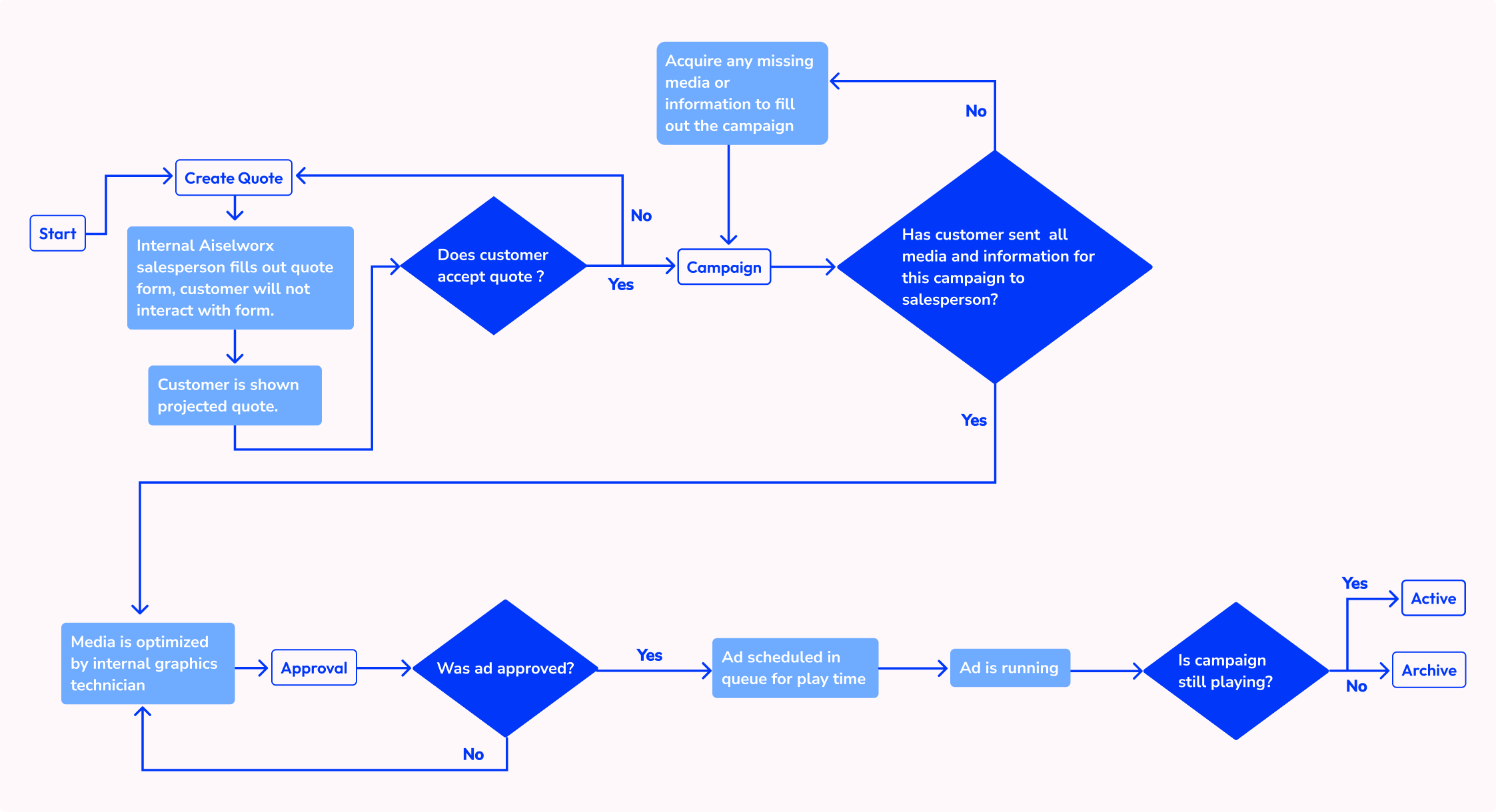
The current process is handled manually, which is hard to track and be a tedious process with a lot of back and forth. There are several steps an advertiser and sales person must go through with their media before they are able to play this new round of ads, termed a campaign, on the carts.

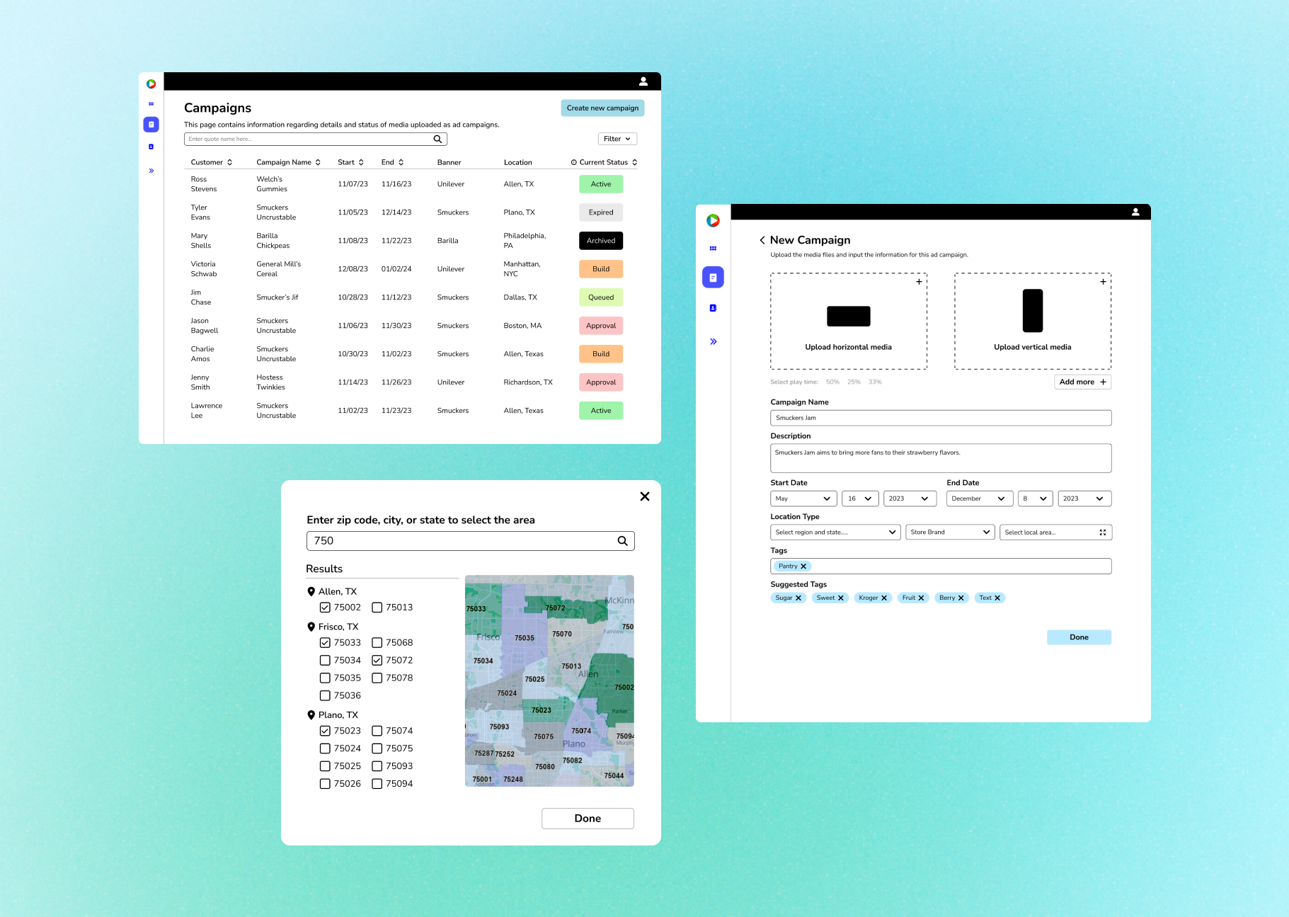
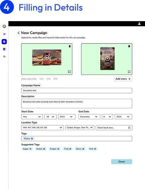
According to the insights gathered from the sales team, there were several essential components that needed to be included in the design of the campaign creation flow. These elements provide the advertisers varied options for playing their selected media and also enable the media to be catalogued correctly on the hosting platform.


All information and media needed to run a campaign can now be recorded as well as edited on site by the sales team or even an account representative from a grocery retailer, making campaign creation a smoother process.

Letting the user know if the media file they have uploaded is within the correct aspect ratio and resolution right after they have uploaded the file allows for a quicker correction if they don't and reduces friction when their campaign is being reviewed for approval.
When the user finishes adding their new campaign, it will be queued up and displayed on the campaign overview page. There are several steps in the queuing process that the campaign passes through before getting played. We wanted users to be able to quickly look at the overview and be able to figure out which step their campaign was on, so we decided to associate each stage of the process with a certain color.
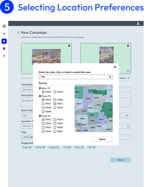
A ad campaign can be played in select locations and selection for those locations can be as detailed as designating where ads are run by zipcode.

I conducted usability tests with the sales team to make sure this design was solving the problems they were facing with the current process.
Straight forward and easy to understand what to do for creating a campaign.
Locating assets and editing details seem like a simple process, even when revisiting for later edits.
Feature Improvement Opportunities: Users mentioned that the division of media play time was confusing to understand at first.
During this project, I communicated a lot with our software developers to understand design limitations and platform requirements. Knowing beforehand what was possible and what was not helped inform my design choices and made my ideation process more efficient.
When designing new features, it is best to start from the most basic building blocks of a feature rather than adding everything at once so that adjusting for software feasibility will be easier.